Naming Conventions for Niagara Graphics That Scale Across Technicians
Inconsistent naming is one of the fastest ways Niagara graphics drift across technicians. Learn how to structure equipment, point, and alarm naming conventions in Niagara N4 so your projects remain searchable, reusable, and scalable.
Niagara Graphics Standards: What to Define (So Contractors Can’t Wing It)
Most Niagara graphics drift over time because standards were never clearly defined. In this article, we break down exactly what to document inside your Niagara Framework deployments — from naming conventions and tagging strategy to layout rules, color logic, navigation structure, and commissioning checklists — so contractors can’t improvise and compromise long-term scalability.

Designing for Confidence: Visuals Operators Trust
Operators don’t trust BAS visuals because they’re pretty—they trust them because they’re clear, consistent, and honest about system state. This post explains what builds confidence in an operator interface: eliminating ambiguity (command vs status, setpoint vs actual), standardizing layouts, showing the full control story, surfacing comm loss and overrides, and making verification easy.

Why “At-a-Glance” Visuals Beat Text-Heavy Screens
Text-heavy BAS screens force operators to read line by line, slowing diagnosis and increasing mistakes. This post explains why at-a-glance visuals work better: they prioritize exceptions, show meaning (setpoint vs actual, command vs status), reduce ambiguity, and make drill-down and verification faster—so buildings run smoother with fewer delays and callbacks.
The 7 Traits of a High-Performance Operator Interface
A high-performance operator interface isn’t about fancy graphics—it’s about speed and reliability. This post breaks down the 7 traits that make BAS UIs faster to use: obvious exceptions, workflow-first navigation, clear command vs. status, consistent setpoint vs. actual, reusable templates, fewer clicks, and easy verification to prevent errors and callbacks.
Aesthetics vs Functional UI: How Great BAS Visuals Do Both
Great BAS visuals aren’t “pretty vs. practical”—they’re both. This post breaks down how aesthetics can improve operator speed when they support clarity, hierarchy, and consistency, and how “slick” design can backfire when it hurts readability. Learn what great BAS UI looks like and why it reduces errors, delays, and callbacks.

Visual Hierarchy in Dashboards: How to Make the Right Thing Obvious
Visual hierarchy is what makes BAS dashboards feel fast: normal stays quiet, exceptions stand out, and the next action is obvious. This post breaks down practical hierarchy rules—size, placement, contrast, grouping, and labeling—so operators spot issues in seconds, reduce clicks, and avoid costly mistakes.
The Hidden Cost of Ugly BAS Graphics: Errors, Delays, and Callbacks
Ugly BAS graphics aren’t just an eyesore—they create real operational cost through operator errors, slow diagnosis, and unnecessary callbacks. This post breaks down how unclear visuals increase downtime, training burden, and hidden energy waste—and what “good” graphics do differently.
From Data to Visuals: The UI Layer That Makes Operators Faster
Most BAS platforms already have the data—operators lose time because the UI makes them hunt for answers. This post explains the UI layer that turns raw points into fast, repeatable workflows: detect issues, drill down, diagnose, take action, and verify—without the click maze.

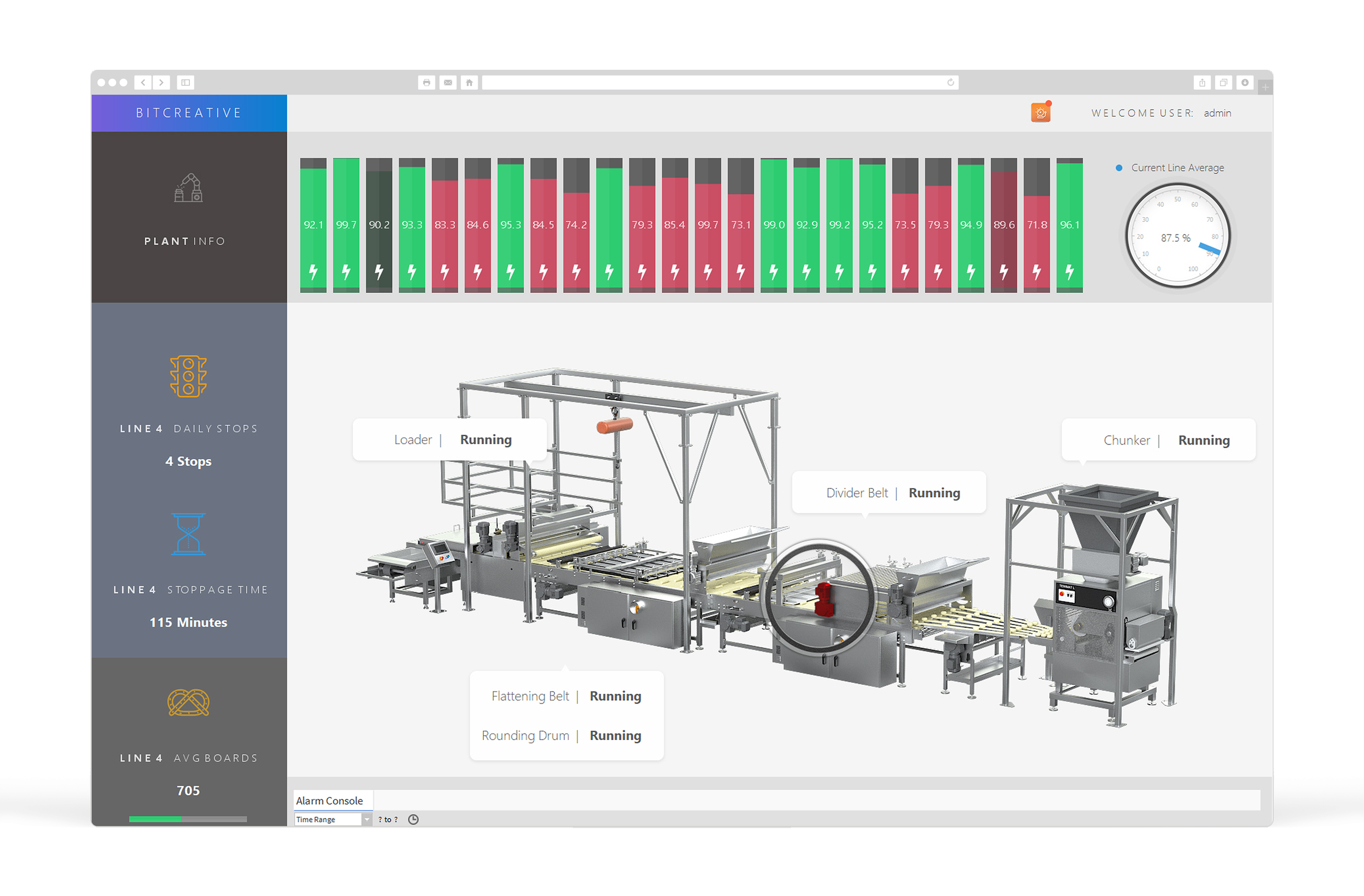
What “Command-Center Visuals” Mean in Building Automation (and Why It Matters)
Command-center visuals turn building automation data into an at-a-glance operational view—so teams can spot issues faster, reduce clicks, and run buildings more efficiently. Learn what they are, what they should include, and why they matter.

Minimalist Dashboards for Complex Systems: A Practical Guide
Minimalist BAS dashboards aren’t about showing less—they’re about showing less noise and more meaning. This practical guide explains how to design clean home screens for complex systems: prioritize an exception stack, use a 3-layer structure (summary, context, drill-down), keep normal visually quiet, standardize layouts, reduce navigation clutter, and make verification fast so operators stay confident.