The Hidden Cost of Ugly BAS Graphics: Errors, Delays, and Callbacks
Most people treat BAS graphics like a “nice-to-have.” A cosmetic layer. Something you polish at the end if there’s time.
That’s a mistake.
Ugly—or more accurately, unclear and inconsistent—BAS graphics create real operational costs. Not theoretical. Not “soft” costs. The kind that show up as wasted labor, missed alarms, bad overrides, comfort complaints, and unnecessary service dispatches.
This post breaks down the hidden price you pay for weak BAS visuals, and why the UI layer is often one of the fastest ROI improvements you can make in building operations.
“Ugly” Usually Means “High Friction”
Let’s define terms. When operators say graphics are “ugly,” they usually don’t mean the color palette.
They mean:
it takes too many clicks to find what they need
points are unlabeled or inconsistently named
status is unclear (is it commanded on or actually running?)
alarms don’t stand out or don’t route cleanly
screens are cluttered with junk but missing the one thing that matters
each system is drawn differently, so users constantly re-learn the interface
That’s not aesthetic. That’s friction.
And friction becomes cost.
Cost #1: Operator Errors (The Most Expensive “Invisible” Problem)
When visuals are unclear, operators make mistakes—even good ones.
Common error patterns caused by poor graphics:
adjusting the wrong setpoint because labels aren’t clear
overriding a point and forgetting it (or not realizing it’s already overridden)
missing an interlock condition (unit won’t start → operator forces it)
assuming something is “running” based on a command, not actual status
chasing the wrong piece of equipment because navigation is inconsistent
These mistakes compound because BAS work is repetitive and time-sensitive. A small UI mistake can ripple into:
comfort complaints
equipment stress
wasted energy
follow-on alarms
extra troubleshooting time
The UI didn’t just “look bad.” It increased the probability of human error.
Cost #2: Delays in Diagnosis (Click Mazes Kill Response Time)
Speed matters. Not because operators are impatient—but because buildings don’t wait.
The classic BAS time sink looks like this:
Alarm comes in
Operator opens a generic alarm list
Tries to locate the affected system
Clicks through a tree
Finds a graphic
That graphic doesn’t show enough context
Opens another view
Pulls trends
Searches for related points
Finally figures out what’s happening
That’s 10 minutes for something that should take 60 seconds.
When this happens across dozens of “small” issues, you get a very real cost:
slower response times
longer downtime
higher complaint volume
more missed early-warning signs (drift, sensor degradation, intermittent faults)
A great UI compresses that workflow:
alarm → location → context → likely cause → action → verify

Cost #3: Callbacks (Because the System Isn’t “Self-Explaining”)
This one hurts because callbacks are expensive and preventable.
Poor graphics create callbacks in two main ways:
A) Service technicians spend time just “finding things”
If the UI isn’t consistent, techs waste time:
hunting for points
figuring out naming conventions
learning where screens are hidden
manually building their own diagnosis approach each time
B) The building team can’t confidently operate the system
If operators don’t trust the graphics—or can’t interpret them quickly—they call for service more often.
A clean UI reduces service dependency because it makes the system self-explaining:
setpoint vs actual is obvious
command vs status is obvious
“why it won’t start” is visible (safeties, interlocks)
overrides are prominent and time-limited
dependencies are linked
That translates into fewer “no trouble found” dispatches and fewer repeat visits.
Cost #4: Training Time (And Reliance on Tribal Knowledge)
If your BAS UI requires a long-tenured operator to explain it, you don’t have a scalable system—you have tribal knowledge.
Bad UI increases:
onboarding time for new operators
errors during shift coverage
reliance on specific individuals who “know where everything is”
risk when key people leave or retire
A standardized visual system reduces training time dramatically because screens behave predictably:
same layout across equipment
same navigation patterns
same labeling logic
same alarm/priority visuals
Cost #5: Energy Waste That Never Gets Caught
Energy waste is often not caused by one massive failure. It’s death by a thousand small issues:
stuck dampers
drifting sensors
simultaneous heating and cooling
schedules that don’t match occupancy
overrides that never got cleared
poor reset strategies that go unnoticed
Ugly graphics hide these problems because:
exceptions don’t stand out
trends aren’t easy to access
“normal” ranges aren’t visually defined
key KPIs are buried
When the UI makes waste obvious, it gets corrected faster. When it hides waste, it becomes your baseline.
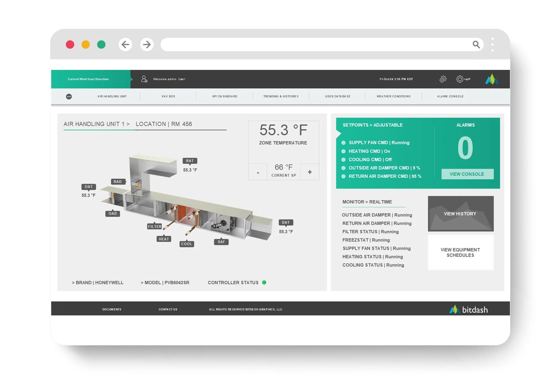
What “Good” Graphics Actually Do
Good BAS graphics are not “art.” They’re tools.
They do a few things exceptionally well:
1) Show you what’s abnormal first
Normal should be quiet. Exceptions should pop.
2) Put context next to action
If you can change a setpoint, you should immediately see:
current value
related sensor reading
operating mode
recent trend
3) Standardize across the building (and portfolio)
The AHU template should feel like an AHU template everywhere.
4) Reduce the number of clicks to answers
If the UI doesn’t reduce clicks, it’s not doing its job.
5) Make overrides and risk conditions impossible to miss
Overrides should be flagged, time-limited, and visible on the home screen.
Quick Self-Test: Are Your Graphics Costing You Money?
If you answer “yes” to any of these, you’re paying the hidden UI tax:
Do operators complain that “it’s in there somewhere”?
Do you have frequent overrides left in place?
Do alarms come in but get resolved slowly?
Does each building look different in the BAS?
Do technicians waste time finding points/screens?
Do you get “no trouble found” or repeat callbacks?
Do comfort complaints spike during shift changes or vacations?
That’s not an operations problem. That’s a UI system problem.
The Bottom Line
Ugly BAS graphics don’t just look bad—they create:
errors
delays
callbacks
training drag
hidden energy waste
Improving the UI layer is one of the rare upgrades that touches everything: operator speed, service efficiency, tenant experience, and building performance.
Want a Fast UI Cost Audit?
If you share 3–5 screenshots (an overview screen, an AHU graphic, a plant screen, your alarm summary, and your navigation tree), we can quickly point out the biggest friction points and the highest-impact fixes that will reduce errors, response time, and callbacks—without rebuilding your whole BAS.