The 7 Traits of a High-Performance Operator Interface

Most building automation systems don’t fail because the controls are wrong. They fail because the operator experience is slow.
The data is there. The alarms are there. The logic is there. But when the interface is cluttered, inconsistent, or unclear, operators waste time hunting for answers—and that shows up as delays, errors, comfort complaints, and service callbacks.
A high-performance operator interface is one that makes operators faster, more consistent, and less likely to make mistakes under pressure.
Here are the 7 traits that separate “screens that exist” from “an interface operators trust.”
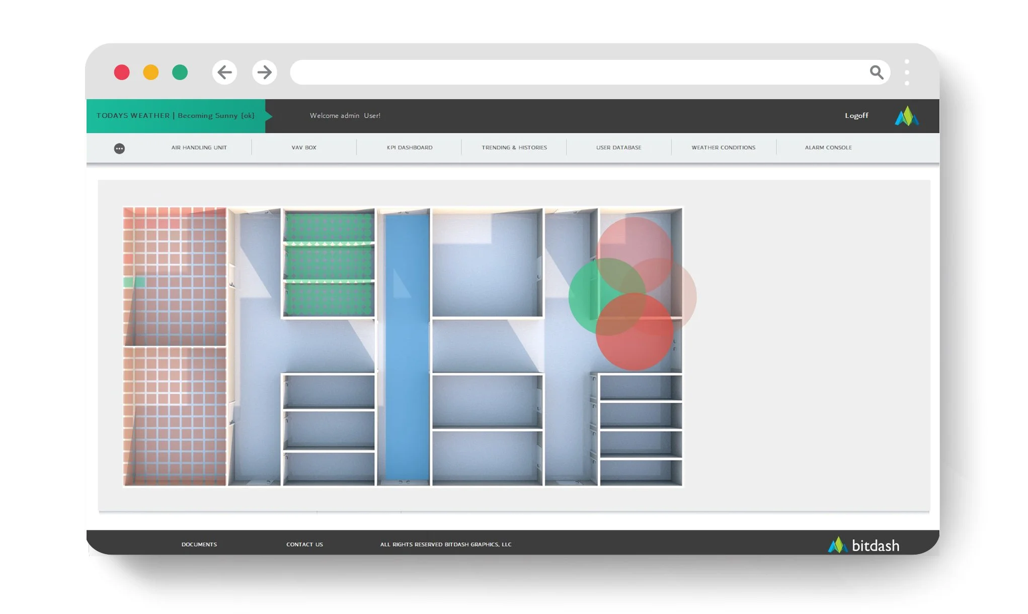
1) It makes exceptions obvious (normal stays quiet)
In a good interface, “everything is normal” should look calm. The UI should only demand attention when something is abnormal:
critical alarms
offline devices / comm loss
failed starts
overrides and manual modes
out-of-range values
If everything is colorful, nothing is meaningful. High-performance UIs use emphasis sparingly so exceptions stand out instantly.
2) It’s built around operator workflow, not engineering structure
Operators don’t think in point trees. They think in actions:
What’s wrong?
Where is it?
Why is it happening?
What do I do next?
Did it work?
A high-performance interface is designed around that flow. It gives operators a predictable path from overview → equipment → context → action → verification, instead of forcing them to jump between unrelated screens.
3) Command vs. status is never ambiguous
This is one of the most common causes of confusion and misdiagnosis:
Command: what the system is telling something to do
Status: what the equipment is actually doing
High-performance UIs make this distinction unavoidable. Operators shouldn’t have to guess whether a fan is commanded on but not proving status, or whether a valve is requested open but not moving.
When command and status are clearly separated (and shown side-by-side), diagnosis gets faster and mistakes drop.
4) Setpoint vs. actual is always clear (and consistent)
The UI should present the “control story” in one glance:
setpoint
actual reading
mode (occupied/unoccupied, heating/cooling, enable/disable)
context (limits, normal ranges, alarms)
If setpoint/actual are buried, inconsistent, or unlabeled, operators lose time and make wrong adjustments.
Consistency matters: if every equipment page shows setpoint and actual in the same location and format, operators become faster automatically.
5) It uses repeatable templates (so every AHU doesn’t feel different)
If each piece of equipment has a unique graphic style, layout, and navigation pattern, you’ve created a training problem and a reliability problem.
High-performance interfaces are template-driven:
AHUs follow the same structure everywhere
plant screens follow a consistent logic
navigation and buttons behave the same way
alarms and overrides are displayed the same way
Templates don’t reduce capability—they reduce friction. They also make future expansion and ongoing maintenance dramatically easier.
6) It reduces clicks with smart drill-down (no click maze)
Fast interfaces minimize the number of steps between “I see the problem” and “I understand the cause.”
That doesn’t mean cramming everything onto one page. It means:
clear overview screens that summarize exceptions
logical drill-down paths (building → system → equipment → component)
one-click access to trends/history for the exact equipment you’re viewing
obvious navigation back to the overview without losing your place
If operators need 8–12 clicks to answer a basic question, the UI is taxing them every single day.
7) It makes verification easy (so fixes stick)
Most BAS interfaces focus on control actions but ignore confirmation. Verification is where you avoid repeat issues and callbacks.
A high-performance UI makes it easy to confirm:
did the status change after the command?
did the alarm clear?
did the trend move in the expected direction?
did an override expire (or is it still active)?
This is where “good UI” becomes “reliable operations.” Without verification, you get ghost problems and repeated service calls.
The quick test: does your interface make operators faster?
If you want a fast gut-check, answer these:
Can someone see critical issues in 5 seconds from the home screen?
Are overrides impossible to miss?
Is command vs status always clear?
Is setpoint vs actual always presented the same way?
Can you get to trends for the current equipment in one click?
Do similar assets look and behave consistently?
Can a new operator learn the system without tribal knowledge?
If not, you’re leaving speed—and money—on the table.
The bottom line
A high-performance operator interface isn’t about fancy graphics. It’s about operational outcomes:
fewer errors
faster diagnosis
fewer callbacks
better comfort and reliability
lower training burden
less hidden energy waste
When the UI layer is designed like an operator tool instead of an afterthought, the whole building runs better.
Want a quick “7 traits” scorecard?
Send an overview dashboard screenshot and one equipment page (AHU or plant). We’ll tell you which of the seven traits you’re strong on, where friction is hiding, and what changes would deliver the biggest speed gains.