Why “At-a-Glance” Visuals Beat Text-Heavy Screens
If you’ve ever watched a good operator work, you’ll notice something: they don’t “read” the BAS. They scan it.
They’re not trying to absorb a wall of point names. They’re trying to answer a few urgent questions fast:
What’s wrong right now?
Where is it happening?
Is it getting worse?
What’s the next action?
That’s why “at-a-glance” visuals consistently outperform text-heavy screens in real-world building operations. It’s not a design preference. It’s a performance advantage.
Text-heavy BAS screens create a bottleneck: reading speed
Text screens force operators into the slowest possible mode: serial processing.
When you show someone:
a long point list
a dense alarm table
a tree full of abbreviations
unlabeled or inconsistently labeled values
…you’re asking them to read line by line, interpret meaning, and assemble a picture mentally.
Even when the data is accurate, the workflow is slow. And under pressure, slow becomes risky.
At-a-glance visuals flip the model: they let the operator understand the system state in parallel, with a quick scan.
Operators need “meaning,” not “data”
Text-heavy screens tend to present raw values:
temperatures
pressures
fan commands
damper positions
valve outputs
statuses
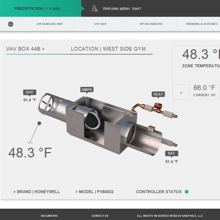
But operators don’t need a spreadsheet. They need context:
setpoint vs actual (and whether it’s drifting)
command vs status (and whether it’s proving)
normal vs abnormal (and how severe)
dependencies (what upstream/downstream is impacted)
a clear drill-down path to trends/history
At-a-glance visuals communicate meaning faster because they organize information around outcomes—not around point storage.
Visuals reduce operator errors (because they reduce guessing)
A lot of BAS errors come from ambiguity:
“Is the unit on?”
“Is this value normal?”
“Did that command actually take?”
“Is it in override?”
“Which damper is which?”
Good visuals remove ambiguity by making state obvious:
status indicators are clear
overrides are flagged
abnormal conditions stand out
equipment context is grouped logically
units and labels are consistent
A wall of text makes operators work too hard to confirm what they’re seeing. That’s where mistakes creep in.
The best at-a-glance screens use hierarchy, not density
At-a-glance does not mean “big cartoon graphic.”
It means prioritization.
A high-performing dashboard does three things:
Surfaces exceptions and priorities (what needs attention)
Shows system health (what’s stable vs unstable)
Makes next actions obvious (where to drill down and verify)
That’s hierarchy. And hierarchy beats density every time.
Text still matters—but only in the right places
This isn’t anti-text. It’s anti-text overload.
Text is perfect for:
details on drill-down screens
alarm descriptions and notes
equipment metadata
audit history and change logs
SOPs and guidance (“if this alarm occurs, check these items”)
But you don’t want text to be the primary way an operator understands the system state.
The ideal pattern is:
visual summary first → text detail on demand
Why this matters more across multiple buildings
If you manage a portfolio, text-heavy screens are a multiplier of pain.
Different integrators will name points differently. Abbreviations vary. Layouts vary. Operators spend time translating the interface instead of running the building.
At-a-glance visuals built on templates reduce that variability:
standardized equipment pages
consistent labels and status logic
predictable navigation patterns
That makes staffing easier, training faster, and shift handoffs cleaner.
The bottom line
“At-a-glance” visuals beat text-heavy screens because they align with how operators actually work:
they scan, not read
they need meaning, not raw point dumps
they need exceptions and priorities first
they need quick drill-down paths to trends and verification
A BAS UI should feel like a control room—not a spreadsheet.
Want a quick “scan speed” test?
Send a screenshot of your main dashboard and one typical equipment page. We’ll tell you whether an operator can understand the system state in 5–10 seconds, what’s creating visual noise, and what changes would make the right information obvious without rebuilding everything.