Aesthetics vs Functional UI: How Great BAS Visuals Do Both
In building automation, “good graphics” get debated the wrong way.
One side wants screens to look modern and polished. The other side rolls their eyes and says, “I don’t care what it looks like—just make it work.”
The reality is: great BAS visuals do both—because aesthetics aren’t decoration. When they’re done correctly, aesthetics are part of function. They reduce mental load, speed navigation, and make it easier for operators to catch problems early and respond correctly.
This post breaks down the real difference between aesthetic-only design and functional UI, where they overlap, and what “great” actually looks like in BAS dashboards and equipment graphics.
The problem: people confuse “looks good” with “works well”
A screen can look clean and still be operationally weak.
The most common failure mode is a UI that photographs well but performs poorly under real conditions: lots of polish, not much clarity. You’ll see modern icons, animations, and glossy layouts—but operators still have to hunt through screens to answer basic questions, or worse, they’ll make assumptions because the UI isn’t explicit about what’s commanded vs. what’s actually happening.
If operators still rely on tribal knowledge, excessive clicks, or “I think that’s what this means,” the UI isn’t functional—no matter how modern it looks.
Why aesthetics actually matter in BAS (when they serve the job)
Operators spend real time in these systems, often under pressure. A cluttered interface creates fatigue. A chaotic interface increases error rate. A “busy” interface makes it harder to notice exceptions.
Aesthetics matter because the right design choices directly improve performance: the screen becomes easier to scan, easier to trust, and easier to learn. When visuals are calm, consistent, and readable, operators spend less time decoding the interface and more time solving the problem.
That’s the point: aesthetics are valuable only when they reduce friction.
What “functional UI” means in building automation
Functional UI is the part that makes an operator faster—and safer. It should reliably answer:
What’s wrong?
Where is it?
How bad is it?
What should I do next?
Did the action work?
That requires more than showing points. It requires context and workflow support. A functional BAS visual makes it obvious what’s a command vs. status, what’s a setpoint vs. actual, what’s normal vs. abnormal, and where the operator should go to verify or diagnose (trends, histories, alarms).
If the UI forces people to build the picture in their head from scattered data, it’s not functional—it’s just “a place where data lives.”

Where aesthetics and function overlap (the “both” zone)
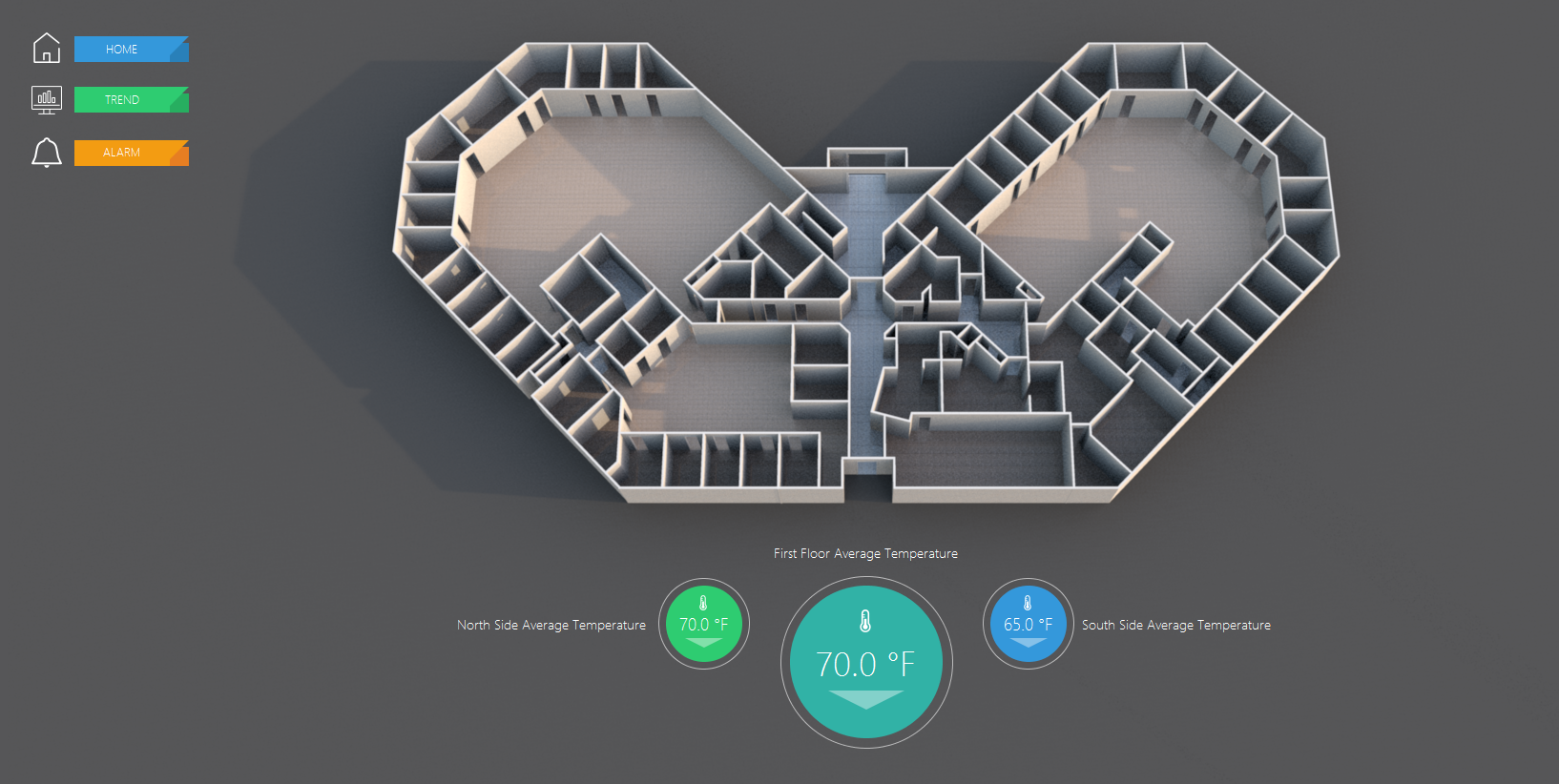
This is where teams should aim: design decisions that make the interface more attractive because it works better.
A strong visual hierarchy is a good example. When the most important information is the easiest to see, the screen looks cleaner and operators move faster. Consistency does the same thing. A standardized set of templates makes the UI feel professional—but more importantly, it means operators don’t have to relearn how every AHU or plant page is organized.
Even “minimalism” is functional when it forces discipline. If a screen can’t explain what’s going on without dumping 80 points onto one page, it’s not communicating—it’s overwhelming. The best systems show only what’s needed to make a decision, and they make it easy to drill down when detail is required.
The trap: aesthetic upgrades that break function
This is where people get burned: they improve “style” and unintentionally reduce usability.
Low-contrast text and tiny labels might look sleek, but it becomes unreadable in a mechanical room, on older monitors, or at the end of a long shift. Too many colors makes everything feel critical, which means alarms and real exceptions stop standing out. Over-designed icons can slow new operators down because the meaning isn’t obvious. And “hero visuals”—big, pretty graphics that dominate the screen—can steal space from the information that actually drives action.
The best BAS visuals are not trying to impress someone in a screenshot. They’re trying to make a building easier to run.
What great BAS visuals actually look like (and why)
Great BAS visuals have a few traits that show up again and again—not because someone decided “this looks good,” but because this is what reduces errors and time-to-resolution.
First, they’re built around how operators work. The UI supports the same loop operators run all day: identify the issue, drill down, diagnose, act, and verify. When this is done right, the screen doesn’t just show information—it guides the next move. If a unit is in fault, you can immediately see the conditions that likely caused it, and you can get to trend/history views without digging.
Second, great visuals are template-driven and consistent. An AHU page should feel like an AHU page everywhere, with the same information in the same locations and the same status logic. That consistency is what reduces training time and eliminates the “who built this one?” problem. It’s also what makes the system scalable across buildings and portfolios.
Third, they prioritize exceptions and keep normal conditions quiet. A good UI doesn’t scream at you when everything is fine. It stays calm, and when something is wrong—offline equipment, overrides, failed starts, out-of-range values—the exception stands out immediately. This is how you reduce missed problems and speed response time without relying on someone’s memory or attentiveness.
Fourth, great visuals make control and context inseparable. If the operator can change a setpoint or command a state, the UI should show the relevant feedback right next to that action: current reading, mode, status confirmation, and ideally an easy path to trends so verification is immediate. This is how you prevent the classic BAS issue of “we changed something… did it actually do anything?”
Finally, great BAS visuals still look professional—because professionalism is not fluff. It affects trust. And trust affects usage. If the UI feels sloppy and inconsistent, operators avoid it, work around it, or default to service calls. A clean, consistent interface tells the operator: this system is reliable, the information is intentional, and you can move quickly without guessing.
The bottom line
In BAS, aesthetics and function aren’t enemies.
Aesthetic choices that improve clarity, hierarchy, and consistency are functional improvements. And functional UI implemented cleanly will naturally look better because it’s organized, calm, and predictable.
The goal isn’t “prettier screens.” It’s faster operators, fewer errors, fewer callbacks, and better building performance—wrapped in a UI people actually want to use.
Want a quick “looks vs works” review?
Send two screenshots:
Your main dashboard
One equipment page (AHU or plant)
We’ll tell you what’s helping operators, what’s slowing them down, and what changes would improve both usability and appearance without turning it into a full rebuild