What “Command-Center Visuals” Mean in Building Automation (and Why It Matters)

If you’ve spent any time inside a building automation system (BAS), you’ve probably seen both extremes:
Screens that technically work… but feel like a spreadsheet with buttons.
Screens that look impressive… but don’t actually help operators make faster, better decisions.
When people say they want “command-center visuals,” they’re usually describing something specific: a user interface that helps an operator understand the building at a glance, spot problems early, and act quickly—without hunting through endless trees, tabs, or point lists.
This post breaks down what command-center visuals actually mean in building automation, what they should include, and why it matters for operations, energy performance, and tenant experience.
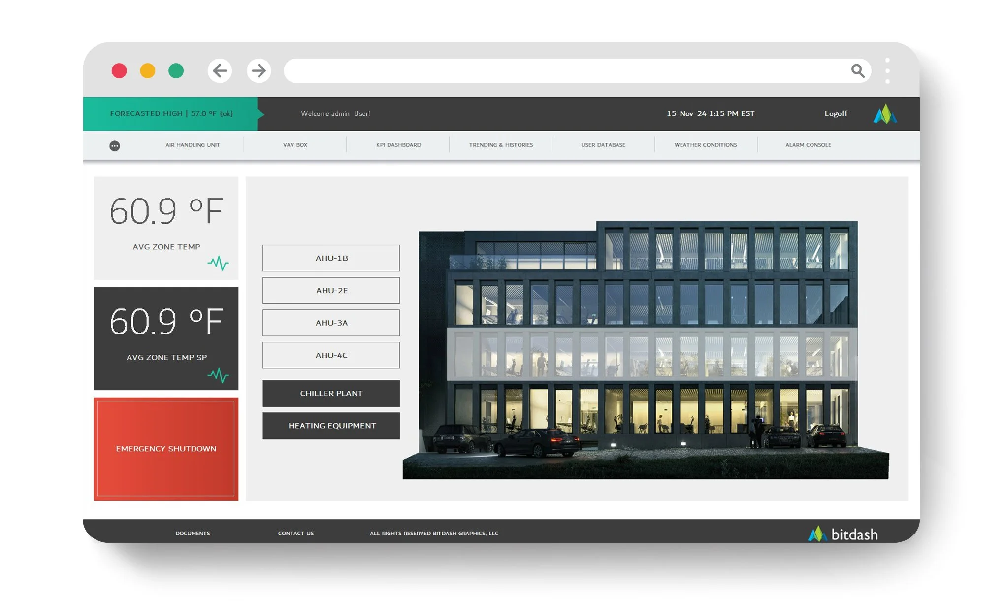
What Are “Command-Center Visuals” in Building Automation?
Command-center visuals are purpose-built BAS dashboards and graphics designed to display the most important building information in a way that is:
Instantly understandable
Actionable
Consistent across systems
Usable on real operator screens (not just a demo)
Think: the difference between data existing vs. data being operationally useful.
In BAS terms, it means creating a visual layer that pulls key information from your Niagara station (or your platform of choice) and presents it in a way that matches how operators actually work.
“Pretty Graphics” vs. “Operational Visuals” (Huge Difference)
A common mistake is thinking command-center visuals are mostly about style. Style matters—because clarity matters—but function is the point.
Here’s the distinction:
Pretty Graphics
look modern
add icons and animations
use slick layouts
feel “high-end” in a presentation
Command-Center Visuals
show the right information, not all information
prioritize abnormal conditions
reduce clicks and navigation depth
support real workflows: alarms → diagnosis → action
make common tasks fast and mistakes less likely
If your “dashboard” doesn’t change how fast someone can detect and resolve issues, it’s just decoration.
The Core Components of a True Command-Center UI
1) A Building “At-a-Glance” Overview
Operators need a home screen that answers, immediately:
What’s not normal right now?
Which systems are the top contributors to issues today?
What requires attention first?
This usually includes:
critical alarms and priorities
top equipment exceptions (offline, failed, overridden, out of setpoint)
key KPIs (temp, humidity, CO₂, pressures, energy, runtime) where relevant
status tiles by system: HVAC, boilers, chillers, AHUs, VAVs, lighting, etc.
2) Drill-Down That Doesn’t Become a Maze
A command-center UI still needs depth, but drill-down should be structured like a decision tree, not a scavenger hunt.
Example workflow:
Overview → System → Equipment → Components → Points → Trends/Overrides
What you want to avoid:
long navigation trees
inconsistent naming
“where did they put that?” syndrome
3) Visual Hierarchy (So the Eye Knows Where to Look)
The best BAS visuals are built around prioritization:
What must the operator notice first?
What’s important but not urgent?
What’s informational?
This is achieved with:
consistent layouts
consistent label positioning
simple grouping
limited “visual noise”
standardized iconography
This sounds like design talk, but in practice it reduces operator fatigue and errors.
4) Standardization Across Buildings and Systems
If you manage multiple facilities, command-center visuals should be repeatable.
That means:
standard navigation patterns
standard colors/status logic (normal/warn/alarm/offline)
standard equipment templates (AHU template looks like an AHU template everywhere)
standard naming conventions
This reduces training time and makes staffing easier.
5) Embedded Context: Not Just Points, But Meaning
Operators don’t need a list of points. They need interpretation:
setpoint vs. actual
normal ranges
expected states (occupied/unoccupied)
interlocks and dependencies
“if this is in alarm, check these three things”
Great visuals bake in context so the operator doesn’t have to mentally assemble it.
Why Command-Center Visuals Matter (Beyond Aesthetics)
Faster Problem Detection = Less Damage and Downtime
Many failures don’t start as catastrophic. They start as:
drift
intermittent faults
poor sequences
overrides left in place
sensors that slowly go bad
A good command-center UI surfaces these patterns early so you fix them before tenants complain—or before equipment gets stressed.
Better Operator Performance (and Less Burnout)
The best operators are valuable—and hard to replace.
If your UI is messy, you’re relying on tribal knowledge:
“Jim knows where that screen is.”
“Ask Maria how to find that boiler override.”
A command-center UI reduces dependence on institutional memory and makes new staff productive faster.
Energy Waste Drops When Issues Are Obvious
Energy waste is rarely a single big thing. It’s usually:
schedules that don’t match occupancy
stuck dampers
simultaneous heating and cooling
VAVs fighting static pressure
overventilation
missed resets
Command-center visuals highlight the conditions that lead to waste so you can address them.
Your BAS Becomes a Service Tool, Not a Data Warehouse
When visuals are right, the BAS becomes a daily operating system:
operators use it confidently
maintenance uses it to diagnose
management uses it to understand performance
service providers can coordinate faster
In other words, it becomes the building’s “command center,” not a place people avoid unless they have to.
Where This Goes Wrong: Common UI Mistakes
Here are the usual culprits that stop a BAS from feeling “command center” grade:
too many points on one screen
inconsistent naming conventions
no standard templates (every AHU looks different)
“overview” screens that don’t prioritize exceptions
buried alarms and weak prioritization
design that looks good in a screenshot but is hard to use daily
over-reliance on third-party layers that complicate upgrades and licensing
What Good Looks Like in Niagara Environments
If you’re in Niagara AX/N4, command-center visuals usually take the form of:
standardized dashboard templates
reusable modules for navigation, buttons, gauges, status cards
graphics designed for multiple form factors (desktop, tablet, kiosk)
consistent wiring to live data points
tight alignment with alarm classes and priorities
The goal is not “a custom graphic for every scenario.” The goal is a repeatable visual system that scales.
The Bottom Line
When someone asks for “command-center visuals,” they’re asking for a BAS UI that makes building operations simpler:
see issues faster
diagnose with less effort
take action with fewer clicks
standardize across sites
reduce waste and downtime
And the biggest payoff is this: a great UI doesn’t just look better—it changes how effectively the building is run.
Want Help Evaluating Your Current Visuals?

If you want a quick reality check, send a few screenshots of your current BAS dashboards/graphics and tell us what platform you’re using (Niagara N4, AX, etc.). We’ll tell you what’s working, what’s slowing operators down, and what a command-center layout would look like for your environment.