Minimalist Dashboards for Complex Systems: A Practical Guide
“Minimalist dashboard” can sound like a design trend. In building automation, it’s not. It’s a performance strategy.
Complex systems—plants, campuses, multi-zone HVAC—create a lot of data. The temptation is to cram more of it onto the screen so nothing is “missing.” That usually backfires. Operators end up staring at a wall of numbers that hides the one thing that’s actually wrong.
A minimalist dashboard isn’t about showing less information. It’s about showing less noise and more meaning—so operators can scan faster, make fewer mistakes, and drill down with intention.
This guide explains how to build minimalist BAS dashboards that still handle complex systems.
First: Minimalism is not “empty space.” It’s prioritization.
If you take nothing else from this post, take this:
Minimalist dashboards are built around exceptions, workflows, and drill-down, not point density.
A minimalist BAS dashboard should answer in 5–10 seconds:
Is anything wrong right now?
Where is it?
How severe is it?
What should I look at next?
Everything else belongs on drill-down screens.
Step 1: Define what the dashboard is for (and what it is not)
A common mistake is trying to make one screen do everything.
A dashboard is for:
monitoring system health
triaging exceptions
providing quick navigation into problems
A dashboard is not for:
full point lists
deep configuration
showing every sensor “just in case”
replacing technician tools
When you keep this boundary, the design gets easier.
Step 2: Build the screen around an “Exception Stack”
In complex BAS environments, operators need a predictable order of importance.
A practical exception stack looks like:
safety/shutdown states
critical alarms
offline/comm loss
overrides/manual modes
out-of-range conditions
efficiency anomalies (optional, but useful)
Your minimalist dashboard should surface these clearly—often in a single summary panel with counts and “top offenders.”
If exceptions don’t stand out, you’ll never be minimalist. You’ll be “dense.”
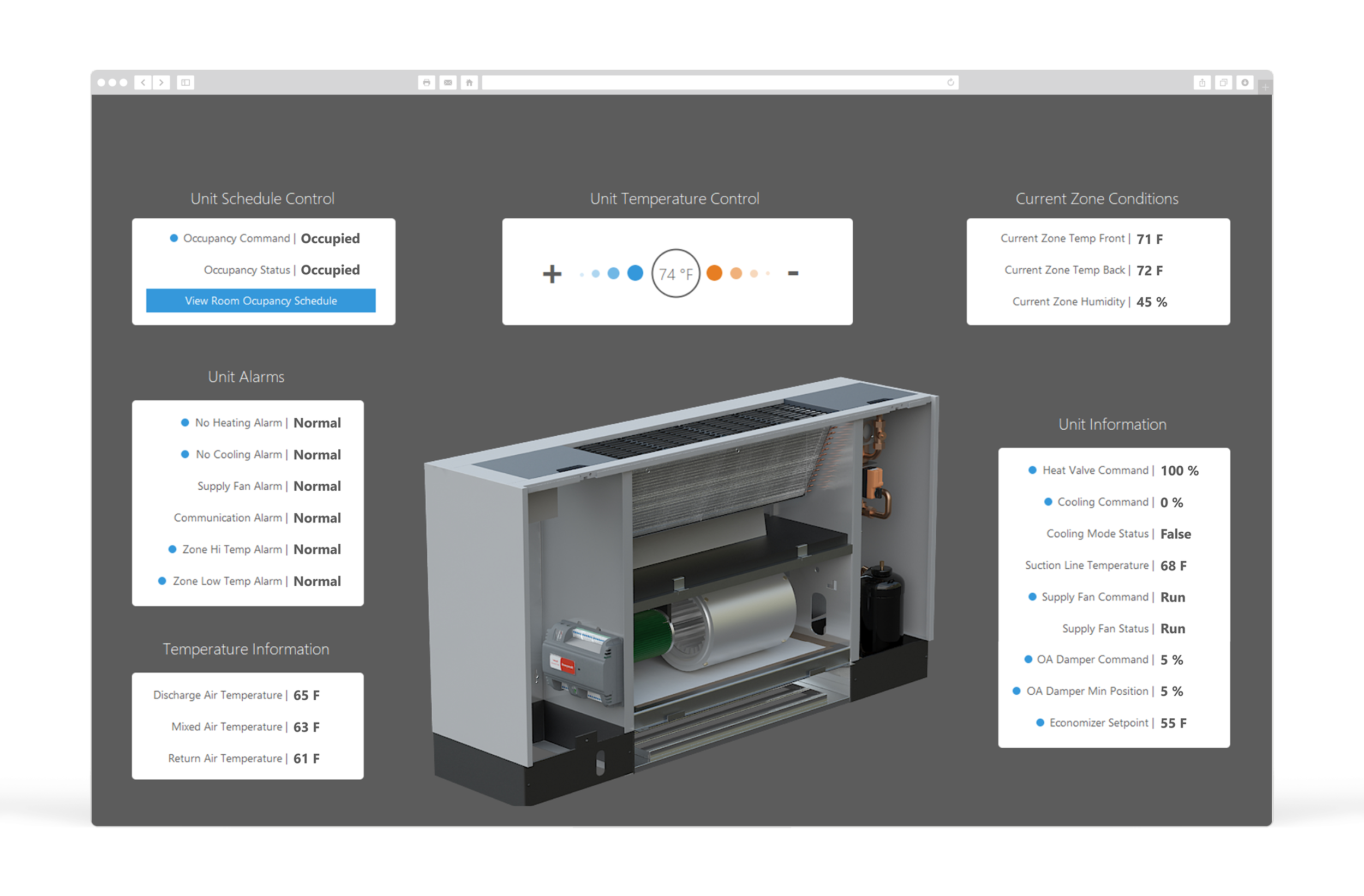
Step 3: Use three layers: Summary → Context → Drill-down
This is the structure that keeps dashboards clean while still powerful.
Layer 1: Summary (what needs attention)
alarm counts by priority
top 5–10 exceptions
equipment offline / failed / in override
a simple “system health” view
Layer 2: Context (what matters for quick decisions)
Only show the values that help make immediate calls, like:
temperatures vs setpoints
pressures vs targets
key plant loop temps (CHW, HW)
demand / load indicators (kW, flow, VFD speed)
Layer 3: Drill-down (where detail lives)
One click from the dashboard should take you to:
an equipment page
a floor/system page
the relevant trends/history for that item
Minimalism depends on drill-down being fast and predictable.
Step 4: Standardize the layout so operators don’t “relearn” the UI
A minimalist dashboard becomes unusable if every building is different.
A practical standard layout:
top-left: exception summary / alarms by priority
top-center: system health tiles (AHUs, plant, zones)
top-right: quick actions (open alarms, view history, search)
lower section: a small set of KPIs/trends that support daily ops
The key is not the exact placement—it’s consistency.
Step 5: Make normal conditions visually quiet
Minimalist design fails if the screen is full of bright colors and status indicators.
Rules that work:
normal state should look calm and uniform
exception states get the emphasis
avoid “rainbow” status colors for everything
use contrast only when it signals action required
When normal looks quiet, the operator’s brain stops working so hard.
Step 6: Reduce “choice overload” with fewer, better navigation options
A cluttered dashboard isn’t just visual clutter—it’s navigation clutter.
Instead of 30 small buttons, provide:
5–10 major navigation routes (systems, buildings, plants, floors)
a search function (where available)
“top issues” links that jump directly to problem equipment
This is how you make complex portfolios feel manageable.
Step 7: Always include verification paths (minimalism requires trust)
Minimal dashboards work only when operators know they can confirm quickly.
That means:
one-click access to trends for any key system
clear indication when points are stale or offline
visible override banners/timers
a predictable “back to dashboard” path
If verification is hard, operators will demand more data on the dashboard—which breaks minimalism.
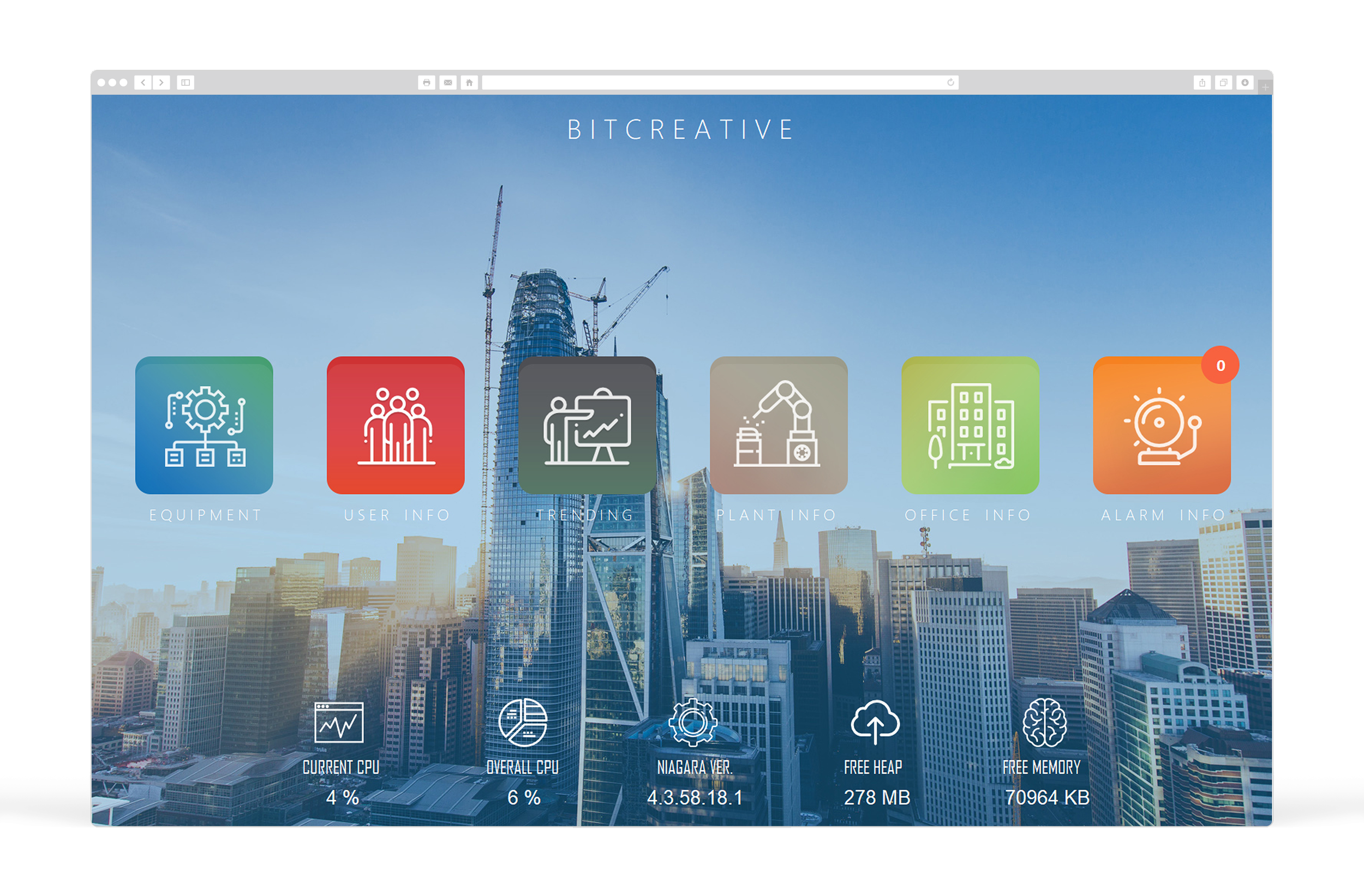
What Minimalist Looks Like in Practice (Examples)
A minimalist BAS home screen often includes:
Alarm summary by priority (counts + top active alarms)
Offline/override summary (counts + top offenders)
System health tiles (AHUs, plant, critical zones)
3–6 KPIs that reflect building stability (not vanity metrics)
Direct links: alarms, trends, schedules, audit history
Everything else is one click away.
The bottom line
Minimalist dashboards aren’t about hiding information. They’re about making complex systems operable.
When you design for exceptions, consistency, and fast drill-down, you get:
faster operator response
fewer errors
fewer callbacks
lower training burden
clearer visibility into real problems (not just noise)
Complex systems demand simple interfaces. That’s how you keep operations fast.
Want a minimalist dashboard blueprint for your site?
Send one screenshot of your current BAS home screen and tell us what platform you’re using. We’ll outline a cleaner layout that keeps all critical visibility while reducing clutter—and we’ll tell you exactly what to move off the dashboard into drill-down pages.