Niagara Graphics Standards: What to Define (So Contractors Can’t Wing It)
If you work inside the Niagara Framework ecosystem long enough, you’ll see a pattern.
Two contractors can deliver the same mechanical system.
One looks clean, structured, scalable.
The other looks like five different people built it under deadline pressure.
The difference isn’t skill.
It’s standards.
Most integrators say they “have standards.”
Very few define them clearly enough that nobody can wing it.
If you want consistency across projects — and across contractors — here’s what actually needs to be defined.
1. Naming Conventions (And Enforce Them)
If your station naming depends on who is building that day, you don’t have standards.
Define:
Equipment prefixes (AHU, RTU, EF, VAV, CHWP, etc.)
Site identifiers
Floor or zone abbreviations
Point naming syntax
Alarm naming structure
For example:
SITE-FLR-EQPT-TYPE-NUMBER
It doesn’t matter what format you choose.
It matters that it never changes.
When naming is inconsistent:
Reusability drops
Global search becomes useless
Tag-based logic gets messy
Cross-site reporting breaks
Standards here directly affect scalability.
2. Tagging Strategy (Not Just Labels)
In Niagara N4, tagging drives:
Navigation
Analytics
Reporting
Dashboards
Alarm filtering
If tagging is optional, it becomes random.
Define:
Required tags for each equipment type
Required point-level tags
Standardized equipment types
Relationships (equip → point → space)
Without a defined tagging structure, every new project becomes a custom rebuild.
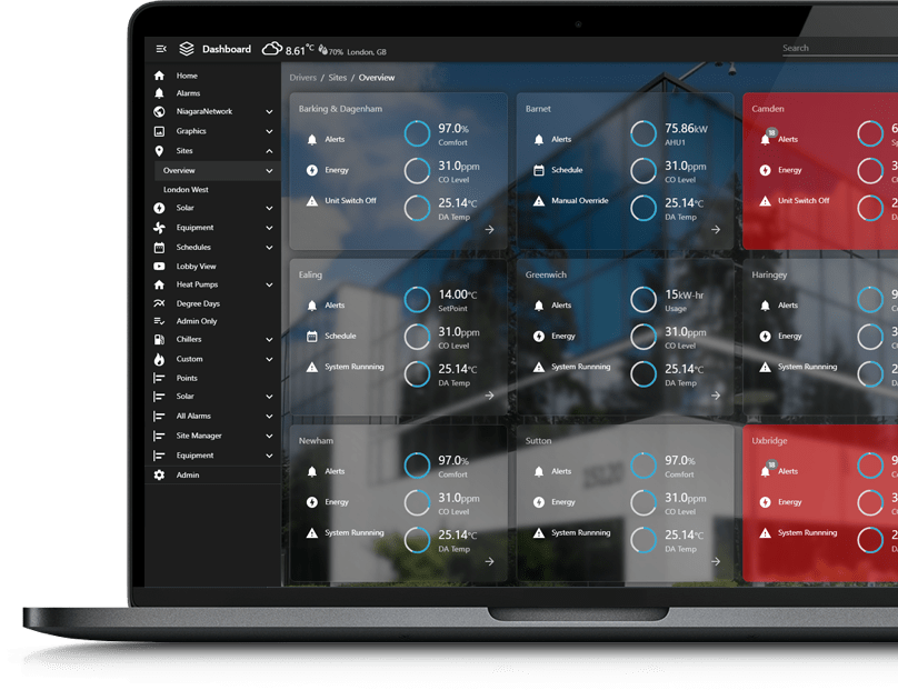
3. Color Language (And What It Means)
Colors in graphics should never be decorative.
Define:
Normal state color
Alarm state color
Disabled state color
Communication loss color
Override indicator color
Example:
Green = Normal
Red = Alarm
Gray = Offline
Yellow = Manual override
If contractors choose colors per project, operators relearn the system every time.
That’s not a UI issue.
That’s an operational risk issue.
4. Layout Rules (Margins, Spacing, Hierarchy)
Most Niagara graphics fall apart visually because layout rules aren’t defined.
Define:
Header height
Navigation placement
Logo placement
Font size hierarchy
Grid spacing
Icon style consistency
If one AHU screen looks different from the next, you don’t have a system.
You have artwork.
Standards create:
Faster commissioning
Faster operator onboarding
Cleaner project turnover
5. Navigation Structure
Define how users move through the system.
Site overview → building → floor → equipment
Always include “Back to Site”
Breadcrumb visibility
Persistent navigation bar rules
Without navigation standards, every contractor builds their own logic tree.
That leads to:
Extra training time
Confusion during emergencies
Slower troubleshooting
6. Graphic Component Rules
If you’re using reusable modules (.jar components, custom widgets, PX fragments), define:
Approved gauges
Approved charts
Approved trend layouts
Button behavior
Pop-up rules
In Niagara Framework, inconsistency here creates:
Version conflicts
Rendering issues
Deployment friction
Maintenance headaches
Standardizing components makes upgrades cleaner.
7. Alarm Display Standards
Alarms are not decoration.
Define:
Alarm summary placement
Critical vs non-critical differentiation
Acknowledgment behavior
Visual prominence
Inconsistent alarm design is not a cosmetic flaw — it’s a liability.
8. Device & Resolution Strategy
Are you designing for:
24” desktop?
Tablet?
Wall-mounted touchscreen?
Mobile browser?
If responsive behavior isn’t defined, contractors design to whatever screen they’re using that day.
That leads to clipping, scaling issues, and unreadable dashboards in the field.
9. Commissioning Checklist for Graphics
If graphics are built but never validated against standards, they drift.
Define:
Pre-turnover graphic review checklist
Naming compliance check
Tag compliance check
Color/state verification
Navigation test
Device test
Standards only work if someone checks them.
Why This Matters for Integrators
Graphics are usually built at the end of a project.
That’s when:
Budget is tight
Time is short
The best engineer is already on the next job
Without defined standards, graphics become:
Rushed
Inconsistent
Margin-draining
Hard to scale
With standards:
You reduce internal rework
You shorten deployment cycles
You increase perceived system quality
You make future expansions easier
And you eliminate the “everyone builds it their own way” problem.
FAQs
What are Niagara graphics standards?
Niagara graphics standards are documented rules that define how user interfaces are built inside the Niagara Framework environment. They cover naming conventions, tagging requirements, color logic, layout structure, navigation flow, and approved components.
The purpose isn’t aesthetic consistency — it’s operational consistency. When standards are defined, every new project follows the same structural logic. That means technicians can move between sites without relearning the interface, engineers can reuse components without rebuilding them, and owners receive systems that behave predictably.
Without standards, every project becomes a custom design exercise. With standards, every project becomes a repeatable deployment.
Why do Niagara projects become inconsistent from site to site?
Most inconsistencies happen because standards live in people’s heads instead of in documentation. One engineer prefers one naming structure. Another prefers a different navigation layout. A third uses slightly different alarm colors.
Individually, those decisions seem minor. Across 10 projects, they create fragmentation.
In the Niagara N4 ecosystem, even small differences in tagging, naming, or layout can break reusability and complicate analytics or reporting later. Over time, that inconsistency increases engineering hours, commissioning time, and service confusion.
Projects drift when rules aren’t defined and enforced.
Should graphics standards be formally documented?
Yes — and documented in more than just a PDF.
Standards should include:
Written naming schemas
Required tag sets by equipment type
Approved UI components
Defined color logic
Layout wireframes
A commissioning checklist
But documentation alone isn’t enough. There must be a review process before turnover. Otherwise, deadlines will override discipline.
The goal isn’t rigidity for its own sake. It’s creating a framework that makes engineering faster, not harder.
Do graphics standards actually improve margin?
They do — but indirectly.
When standards are defined:
Engineers reuse instead of rebuild.
PMs don’t spend hours resolving inconsistencies.
Commissioning goes faster.
Fewer change orders are triggered by visual confusion.
Service teams spend less time deciphering past projects.
That reduction in friction accumulates across projects. Over a year, it can represent hundreds of engineering hours saved.
Standards aren’t about design polish. They’re about controlling labor.
Are standards only important for large multi-site portfolios?
No. Even single-site projects benefit from standards because they future-proof the system.
Buildings change ownership. Expansions happen. Retrofits occur. New contractors inherit existing stations.
If a site is built with consistent naming, tagging, and layout logic, future work becomes easier and less expensive. If it’s built ad hoc, every expansion becomes a reverse-engineering exercise.
Standards protect future flexibility.
Can you standardize graphics without limiting customization?
Yes — if you standardize structure, not creativity.
Define:
Grid systems
Navigation logic
Color semantics
Component libraries
Then allow branding or minor aesthetic adjustments within that framework.
The best Niagara deployments don’t look identical across clients — they feel structurally identical. That’s the difference.
Final Thought
If your graphics depend on who’s building them, you don’t have standards.
You have preferences.
Defined standards turn Niagara graphics from an afterthought into an asset.
And if you want them implemented in a way that scales cleanly across projects — that’s exactly the layer we build for.